
Two Checks Before You Print Coors Banquet Dirt Bike Graphics
If you commission or resell Coors Banquet dirt bike graphics for vintage enduro builds, two things have to be settled before vinyl goes near the printer: your right to use the trademark, and whether the printed color matches the panels it will sit on. Neither can be fixed once the decals are cut.
Trademark use is the legal side. Coors Banquet is a registered brand, so reproducing the wordmark, ribbon, or label artwork on product you sell is a licensing decision before it is a design decision. Confirm what you are permitted to produce, in writing, and keep that record with the job file.
Panel color is the physical side. Vintage enduro plastics fade, get replaced, and often arrive in a different shade than the catalog spec, so the printed gold, white, and red have to be judged against the actual tank, fenders, and side covers.
Four things should be on hand before the first proof:
- Written confirmation of permitted brand usage for the specific product and market
- Physical color readings from the customer’s actual plastics, not a catalog swatch
- A signed proof showing placement across tank, shrouds, and side panels
- A stated substrate and laminate, since both shift how the gold reads under light
With all four settled, the print run is routine. Without them you are choosing between a refund and a reprint.
Trademark Use, Licensed Artwork, and Beverage-Branded Graphic Kits
A beverage-branded kit looks like one product on the shelf. In legal terms it is two assets stacked together: someone else’s trademark use rights on top, your reproduction of the artwork underneath. Shops and resellers get into trouble by treating those as a single design file. If you plan to sell custom motorcycle graphics built around a beer or soft-drink identity, this is the section that decides whether you have a business or a liability.
The brand mark and the artwork layer are not the same asset
The brand mark — the wordmark, the crest, the color lockup — is a registered or claimed source identifier owned by the beverage company, and it signals who stands behind the product. The artwork layer is the illustration, stripe layout, panel arrangement, and typography treatment that wraps a shroud or number plate. A designer can license you the artwork layer and leave you with no rights to the mark. A mark owner can authorize logo use without owning the illustration you built around it. Two permissions, two owners, two documents.
“It is just a decal” does not survive contact with a lawyer
Size is irrelevant. Affixing a mark to goods that move in commerce is use in trade, and that includes a 4-inch shroud decal on a vintage enduro build. The defense that “we only printed it, we didn’t sell the beer” fails, because the risk sits with whoever puts the marked goods into the stream of commerce, and that is usually the shop that printed, listed, and shipped them. Your customer’s intent does not move the risk to your customer.
What nominative or licensed use generally requires
- Nominative use (referring to the brand to describe compatibility or fit) generally requires that the reference be truthful, necessary, and free of any suggestion of sponsorship or endorsement.
- Licensed use (actually reproducing the mark) generally requires a written scope of use, territory, term, royalty or fee structure, quality-control standards, and pre-production proof approval from the mark owner.
Documented permissions to collect before the press runs
| Permission | Issued by | Why it matters |
|---|---|---|
| Trademark license or written authorization letter | Brand owner or its licensing agent | Establishes your right to reproduce the mark at all |
| Approved style guide and color lockup | Brand owner’s marketing or brand team | Prevents “close enough” color and spacing claims |
| Artwork reproduction rights | Original illustrator or studio | Covers the design layer the mark sits on |
| Property or model releases | Photographer, rider, venue | Covers imagery inside the layout |
| Distributor or reseller consent | Brand’s regional distributor | Confirms channel and territory limits |
Keep these on file with a date stamp and match them to the specific SKU. Our graphic kit categories show how each panel in a kit is documented, if you want a model to copy.
The risk, stated in business terms
- Inventory seizure and destruction: marked stock can be pulled and destroyed, and you absorb the loss on finished goods.
- Takedown notices: marketplace and payment-processor complaints can freeze listings and payouts overnight.
- Reprint cost: reversal means new plates, new vinyl, new labor, and a scrap pile you already paid for.
- Liability to clients: a dealer or race team that bought your kit inherits the dispute, and commercial buyers sue the vendor who warranted the product.
A clearance memo costs a fraction of one seized pallet, and licensed artwork only protects you when the paperwork names the mark, the product, and the territory. Get written permission from the mark owner before you print, and let that document override verbal assurances, “everyone does it” arguments, and optimistic readings of fair use.
Pre-Print Clearance Checks
Run this list before the printer warms up on a Coors Banquet tribute set. It takes about ten minutes.
- Confirm signed brand authorization records are filed and current for every logo you plan to reproduce.
- Verify artwork source files are layered, print-ready, and traceable to a licensed original.
- Match panel colors against an approved brand palette reference under daylight, not screen glow.
- Confirm the intended geography of sale matches the territory granted in your license terms.
- Record whether each graphic kit is sold for resale or produced strictly for personal use.
- Retain vendor documentation, purchase orders, and proofs for the full required retention period.
Two things come up repeatedly. Monitor-to-vinyl drift is normal, so pull a physical swatch every time. And when a customer asks you to “just tweak” a trademark, that request goes to the rights holder in writing, not into your design file.
With the paperwork clean, you can browse our dirt bike graphics kits to compare panel layouts before you commit to a cut file.
Ownership and confirmation points by asset type, before a single panel is produced:
| Asset Type | Who Owns It | What Must Be Confirmed Before Printing | Primary Business Risk |
|---|---|---|---|
| Beverage brand name and wordmark | The beverage company (trademark owner) | Written permission for commercial use and the correct logo lockup | Trademark infringement claim and forced takedown of printed stock |
| Brand color palette | The brand owner (trade dress, not always registered) | Exact Pantone or CMYK values and an approved color match under shop lighting | A look that reads as confusingly similar, plus a cease-and-desist letter |
| Photographic or illustrative artwork | The photographer, illustrator, or brand | License scope that explicitly covers print reproduction and resale | Copyright claim and a wasted print run |
| Original geometric or sponsor-style layouts made in-house | Your shop | That no third-party marks or protected layout systems were copied | Trade dress copying allegations, reprints, and refunds |
Once every row is clear, match the approved artwork to tested panel templates so color fields and registration stay tight on older plastics.
Panel Color Match: Why “Orange” Is Not a Specification
Ask a customer for the color of their plastics and you will usually get one word: orange, red, yellow, white. That word is a starting point, not a spec, and on a vintage enduro build it is closer to a guess.
Decades of UV exposure change plastic at the surface, and not evenly. A tank that lived under a cover fades differently from a fender that sat in the sun, so two panels from the same original batch no longer agree with each other. Add a mix of panel suppliers across the years, plus non-original replacement parts molded in a “close enough” pigment, and a nominal color name tells you almost nothing about the surface you are printing against.
Why a correct ink mix can still look wrong
A printed fade-resistant vinyl decal can read as a mismatch even when the ink was mixed perfectly. The ink is measured on its own substrate, in isolation. The eye judges it against a surrounding field of aged plastic, under whatever light the bike is standing in. Contrast, gloss level, and the yellow shift of old plastic all push perception away from the measured value. The ink is right; the reference is moving.
Measure it, do not eyeball it
This is why the standard should be a measured comparison rather than a visual approval made in a shop doorway:
- Spectrophotometer readings taken from the actual panels, not from a photo or a catalog swatch.
- Delta E tolerances agreed in advance as an acceptable numerical difference.
- Controlled light-source conditions, because D50, D65, and fluorescent shop lighting will each tell a different story.
| Delta E (ΔE) | What it means in practice |
|---|---|
| Under 1.0 | Practically invisible to the eye; tight batch standard |
| 1.0 – 2.0 | Close, defensible tolerance for matched panel sets |
| 2.0 – 3.0 | Noticeable to a trained eye in side-by-side comparison |
| 3.0 – 5.0 | Visible difference under most lighting |
| Over 5.0 | Reads as a clear mismatch; reprint or re-reference |
Measure the panel, record the reading, name the light source, and quote the Delta E you will hold. Then a dispute is about a number instead of someone’s memory of a color.
Agree the tolerance in writing before production
Before a single sheet goes to print, put the tolerance in the job notes or the quote: the reference panels, the instrument, the light source, and the maximum acceptable Delta E. Once that is signed off, panel color match becomes a checklist item instead of a dispute.
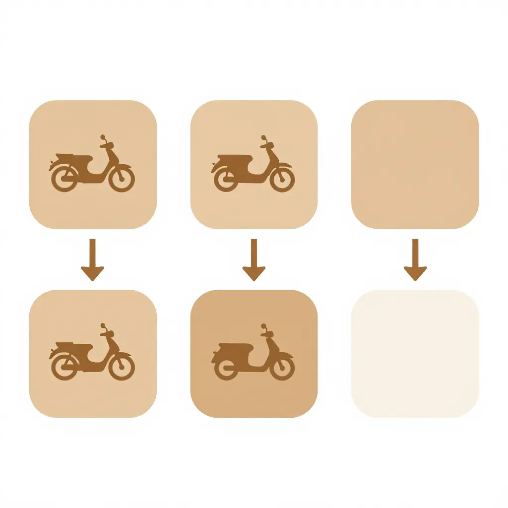
Panel scan, color reference, physical swatch comparison, client sign-off, print release. Nothing leaves the shop until the last box is ticked.
Swatch Verification and Lighting: Prove the Match Before You Print
A color that looks right on your monitor is a suggestion. One that holds up under shop fluorescents, trailer LEDs, and midday sun is a commitment. Before you commit a full run of Coors Banquet-inspired graphics to production, run a physical swatch check: it is the cheapest insurance in the shop, and it stands between a satisfied customer and a reprint you pay for out of your own margin.
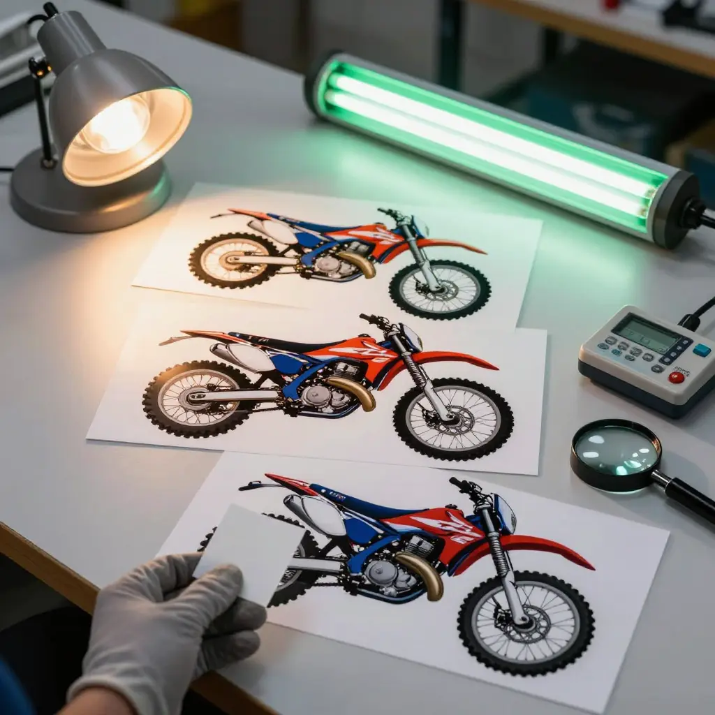
Physical swatch proofing versus on-screen previews
Screen previews are wrong in predictable ways: uncalibrated monitors, wide-gamut rendering, and browser color profiles all shift how a panel reads before ink ever touches film. A customer approving a JPEG on a phone in a dim room is not approving what you will ship.
Print a short proof run on the exact film, ink set, and laminate you intend to use, then judge it in hand at arm’s length against the approved target. Log the measured color deviation (Delta E) rather than trusting your eye alone. Under 1.0 is effectively invisible. A 1.0 to 2.0 reading holds up on matched panel sets, 2.0 to 3.0 is where a trained eye picks it apart side by side, and 3.0 to 5.0 shows under most lighting. Past 5.0, expect a phone call.
Metamerism: the same panel, a different verdict
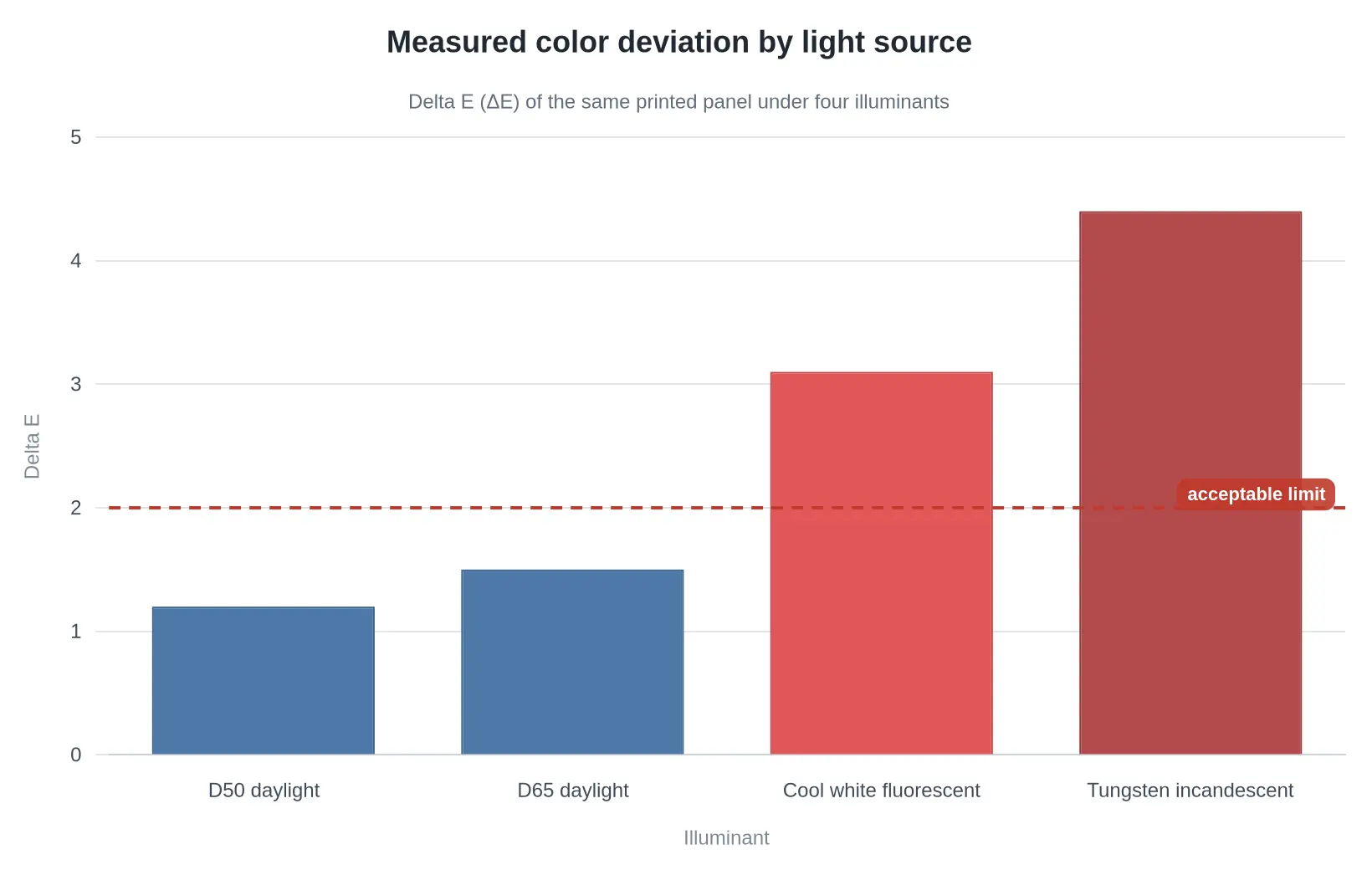
The same print can match under one lamp and split apart under another. That is metamerism, and it hits hardest in the warm palette a vintage Coors Banquet scheme depends on: golds, creams, burgundy, and off-whites. Brand colors specified in one color space rarely translate perfectly into pigment.
Judge every proof under at least three sources: north-facing daylight, cool-white shop fluorescent, and a warm incandescent or headlamp. Real dirt bike panels live under all three.
Matte versus gloss laminate: color is a surface effect
Laminate changes perceived color more than most shops expect, because it changes how light leaves the surface.
| Laminate | Effect on perceived color | Practical trade-off |
|---|---|---|
| Gloss | Deepens darks, boosts apparent saturation, shifts hue slightly under direct light | Looks richer, but shows scratches and scuffs fast on off-road panels |
| Matte | Scatters light, lightens and desaturates; darks can read chalky grey | Hides wear beautifully, but deadens metallic golds |
| Satin | Middle ground, modest shift in both directions | Safest choice when the proof must survive a rider’s scrutiny |
Proof the laminate, not just the ink. A gloss proof approved today does not authorize a matte production run.
Why the signed reference swatch protects you
Keep two identical swatches per job: one for the customer, one in the job file. Date both, note the ink lot, film batch, laminate type, and the illuminants used to approve them, and have the customer sign. Months later that sheet anchors your warranty position, shows what was approved rather than what is remembered, and ends the argument behind most reprint exposure. When the same customer returns for a second set of enduro graphics kits, you match the swatch, not your memory of it.
It also keeps your vinyl decals consistent across a fleet or a rebuild series, where panel-to-panel drift shows up far more than any single print.
Signed, dated, laminated, filed under the job number, and photographed next to the physical vinyl decals under neutral light: that is the whole record, and it takes ten minutes.
Measured Color Deviation: Target Brand Palette vs. Vintage Panel Samples
Before you send a Coors Banquet-inspired graphic set to print, the color decision has to rest on numbers. Faded 1970s and 1980s enduro plastics rarely match the gold-and-red reference you are aiming for, and every panel ages differently depending on sun exposure, fuel spills, and how many times it has been polished. A spectrophotometer reading expressed as Delta E tells you how far each panel has drifted, so you can decide what to print instead of guessing at a swatch under shop lighting.
The chart measures six vintage panel samples against the target brand palette reference.
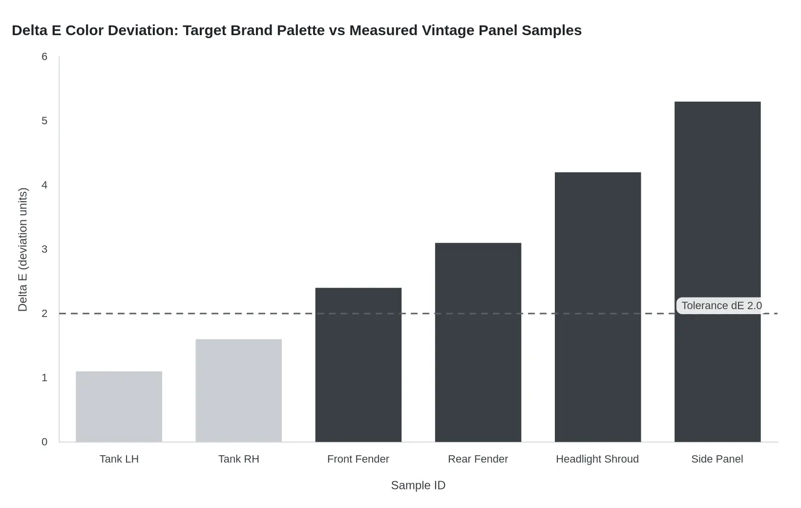
Reading note: Taller bars mean a greater mismatch against the target brand palette, so the tank halves (1.1 and 1.6) read as a close match while the shroud and side panel (4.2 and 5.3) do not. Any sample above the dashed tolerance line at Delta E 2.0 needs either a custom ink mix built to that panel or a documented client approval on file before the job goes to press.
Steps to Release a Branded Kit Safely
Treat a branded run like a controlled manufacturing job, not a quick file drop. Licensing artwork and building a retro replica follow the same sequence, and both are easier to run from a tested base such as our KTM graphics kits for vintage enduro builds. Work through these steps in order so nothing gets printed on a guess.
- Confirm written authorization before you open a single file, and file the signed approval with the job.
- Archive the source artwork exactly as received, with version numbers, layer files, and font notes locked in a read-only folder so the approved design stays untouchable.
- Record the brand palette values, including hex, CMYK, and Pantone equivalents, in one shared spec sheet so no press operator has to reinterpret a color.
- Scan and document the physical panels at true scale, noting curves, bolt holes, and old decal edges, then photograph each panel for the reference file.
- Produce a physical swatch of the printed color and sign off on it in daylight before any full run begins.
- Print the vinyl only after the swatch is approved and the print release is signed, and keep one test panel from the same roll for comparison.
- Inspect the finished panels for color drift, trapped air, edge lift, and cut accuracy, and reject any piece that misses the approved swatch.
Run the list in order every time and the kit leaves with a paper trail, a verified color match, and a finish you can defend.

What You Are Looking At
Top to bottom, this stack is the whole lifespan of a decal. The top band is the laminate, the sacrificial shield that takes the sun, the pressure washer, and the boot scuffs. Beneath it sits the printed ink layer, where the Coors Banquet gold and burgundy either hold their punch or fade into something that looks ten years older than the build. Under that is the base vinyl film that gives the sheet its body and stretch, then the adhesive that decides whether the graphic stays put through heat cycles and vibration.
On a vintage enduro build, the laminate choice is the quiet decision that matters most. A gloss laminate keeps colors saturated and cleans up easily; a matte finish hides scuffs and matches the flatter paint of older plastics. Either way, the thickness of that top layer is what buys you fade resistance in summer sun.
Liability, Quoting, and Vendor Documentation for Branded Print Work
Branded graphics carry two kinds of exposure at once: the intellectual property inside the artwork, and the physical variance inside the print run. Both need to be priced and papered before the first panel is cut, whether you are producing a licensed livery or a house design built for custom motorcycle graphics.
Build reprint risk into the quote
Every print job carries a statistical chance of reprint: a misread file, a shifted panel, a shade that lands outside the approved swatch, a customer who rejects the result after installation. That risk belongs in the price, not in your margin.
- Separate artwork and pre-press fees from production units so rework is billable rather than absorbed.
- Add an explicit contingency line for reprint exposure, sized to your historical rejection and remake rate rather than a round guess.
- Price short runs higher per unit; setup, color matching, and proofing behave as fixed costs regardless of quantity.
- State in writing whether reprints caused by file or approval error are chargeable, and which party absorbs variance-driven reprints.
- Quote a validity window, since substrate and ink costs move and a stale quote invites disputes.
Put trademark responsibility in the client agreement
Your agreement should make ownership of the marks unambiguous. Ask the client to warrant that they hold the rights or a valid license for every logo, wordmark, and trade dress in the artwork, and to confirm the permitted territory, term, and product scope. Include an indemnity clause covering claims that arise from the client’s supplied marks, and add a clause stating that accepting a file implies no license and no endorsement. Require written proof or sign-off before production begins, and reserve the right to decline work where authorization is unclear. Approval of a proof should be documented as acceptance of both content and color intent.
Require a documentation package from every print vendor
A professional print vendor should hand over a complete record set with each job. If they cannot, treat that as a risk signal.
| Document | What it should contain | Held by |
|---|---|---|
| Authorization record | Rights holder, license scope, term, territory, approval contact, date | Client and studio |
| Color reference | Physical master swatch plus numeric values for each critical panel color | Studio archive |
| Swatch approval | Signed or written acceptance of the matched swatch before full run | Client |
| Batch notes | Substrate lot, ink set, RIP and press profile, operator, run date, tolerance results | Print vendor |
Treat the color reference as the single source of truth. Digital values drift between devices; a retained physical swatch is what settles a dispute months later.
Keep repeat orders inside tolerance
Repeat orders fail when something silent changes: a different substrate lot, a swapped ink batch, a new press, or a re-exported file. Specify that repeat runs use the archived batch notes and the original approved swatch, and require the vendor to flag any material or process change before printing. Define an acceptable variance target in the agreement, agree how it will be measured, and require a fresh approval swatch whenever the reference, substrate, or supplier changes. Store every approved swatch and batch record with the job number so the next run starts from evidence instead of memory.
Documentation protects your pricing and your customer relationships. It is not overhead.
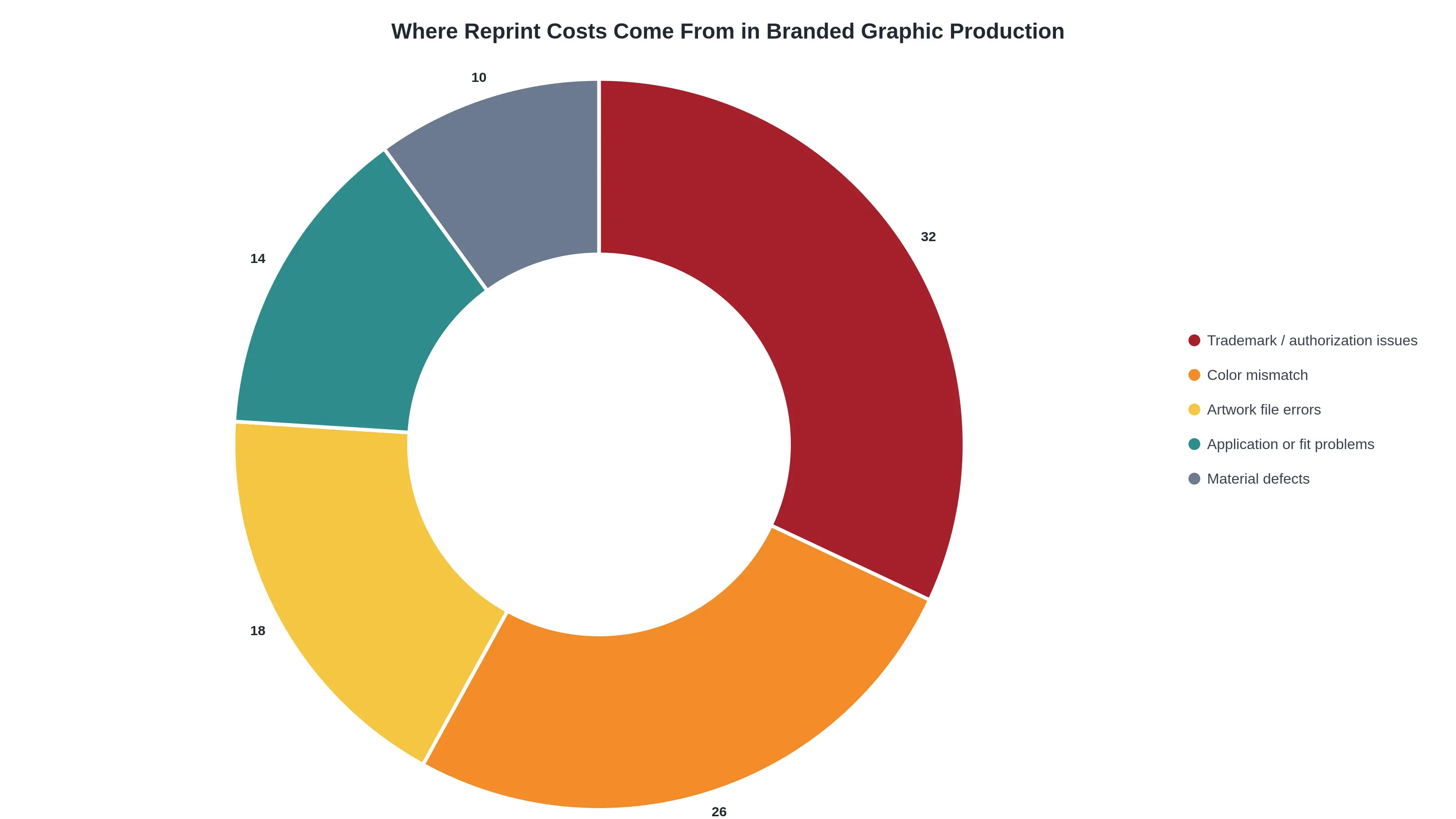
Reading the chart: trademark and authorization questions plus color mismatch come to 58% of reprint exposure, which is why both get priced into the quote before anything hits the printer.
Note: this breakdown reflects our own internal job data and is intended for internal cost planning and risk pricing, not as an absolute measurement of the industry.
Frequently Asked Questions
Can I sell a decal kit that carries a brand name like Coors Banquet without permission?
No. Reproducing a brewery or manufacturer logo on graphics you sell is commercial trademark use, and it needs written permission from the rights holder. Sellers assume that because the artwork is “just decoration” on a dirt bike shroud, nobody will object, but rights holders and marketplaces treat paid reproduction as infringement. Get a license or a signed release before you print anything, and keep that document with the job.
How close does a panel color match need to be?
On a full-wrap vintage enduro build, the goal is a difference nobody notices in daylight, which in practice means holding at or under about 2 Delta E and treating 3.0 as the outer limit you are willing to sign off on. Anything wider starts reading as a patchwork across the tank, shroud, and side panel seams, especially where two pieces butt together. Dial in the panel color match on a test print before you run the full kit, and judge it under shop light and direct sun.
Is a screen preview enough for color approval?
No. A monitor renders color with light, while vinyl, ink, and laminate render it with pigment, so a phone screen will always look more saturated and slightly cooler than the finished part. Approve color from a physical proof printed on the same material and laminated the same way as production. Approving from a screen is approving a guess.
How long do fade-resistant vinyl decals hold color?
Quality cast fade-resistant vinyl decals with a UV laminate typically hold usable color for five to seven years outdoors, and longer on a bike stored inside. Real-world life depends on sun exposure, heat cycles, pressure washing, and whether the graphics sit under a fuel spill. Solvent or cheap calendered films can shift noticeably in a single season, so spec the material, not just the price.
What should I keep on file for future reprints?
Keep the source vector file, the approved Pantone or hex values, the printer and material lot numbers, a laminated proof, and a copy of your trademark use permission on the job ticket. Store them together so a reprint eighteen months later matches the first run instead of restarting the panel color match from zero.
Check Twice, Print Once
A vintage enduro build running Coors Banquet graphics only looks effortless when the boring work happened first. Two checks are non-negotiable before the printer warms up: documented trademark use, meaning a written approval or license that covers the specific marks, the specific artwork, and the quantity you intend to produce; and a measured panel color match, taken with a spectrophotometer or a physical swatch against the actual tank, shroud, or side panel rather than against a screen preview. Screens glow, vinyl reflects, and a gold that looked muted in a mockup can land loud and wrong on a tank that has been in the sun since the 1970s.
The release workflow stays short on purpose. Approve the artwork against the scope of the license, then measure the panel and record the readings. File the approval signature and the color data together, and release the kit only when both documents agree. That one habit turns a one-off favor into a repeatable job.
Explore graphics by model
Whether you are wrapping a vintage enduro tank or a modern electric platform, the same discipline applies, and the same range of ready-to-adapt kits covers both. Shops building a catalog will find KTM graphics for the orange-and-white enduro and motocross line, Surron Light Bee graphics for the compact electric trail bike, Talaria MX3 and MX4 graphics for the mid-size electric MX chassis, Stark Varg MXEX graphics for the full-size electric motocross platform and 79Bike graphics for the light off-road build. Each listing is a starting template, so the artwork still passes through your own trademark review and measured color check before anything prints.
Documented production, the same license record and the same color readings attached to every kit, is what makes a shop’s output reproducible from the first order to the five-hundredth.