
Race Number Size Rules Set the Frame for Every Plate
Number size is the first decision on a plate, and the one that removes the most options from everything after it. Until the digits have a height, a weight and a fixed position, there is no way to judge whether a logo fits, how busy the background can be, or which laminate is worth paying for.
Rulebooks differ, but the substance overlaps: a minimum digit height, a legibility standard, and a limit on what else may share the plate. The AMA rulebook is a clear reference. Its motocross section calls for numerals at least 5 inches (127 mm) high in standard block letters and allows nothing on the number plate except the number, with a 2-inch strip across the top of the front plate reserved for a sponsor or rider name. The off-road section lowers the height to 3.5 inches (89 mm), sets minimum plate dimensions, and asks for three plates of uniform size, shape and colour. Both heights are floors, and neither moves to accommodate a design.
The Five Specifications That Define the Space
The rules tend to converge on five measurements. Not every body publishes all five, and the gaps are where proofs go wrong.
- Minimum digit height – published and enforceable: 5 inches for AMA motocross, 3.5 for the off-road disciplines, and whatever the class sheet says for youth and electric categories. It caps how large anything else on the plate can grow.
- Digit width – seldom given as a number. The practical floor is around two-thirds of the height; below that a numeral loses its shape at distance, whatever the rulebook permits.
- Stroke thickness – also usually left open, which is why it ends up being decided by the material and the plotter rather than by the designer. Hairline weights are the classic failure.
- Spacing between digits – half a digit width is a workable starting point for a two- or three-digit number. Cramped digits merge into one shape at speed.
- Contrast – AMA recommends a white plate with black numerals for A class, yellow with black for B, black with white for C. Mid-tone artwork behind the digits defeats the purpose of any of it.
Why Size Comes Before Style
Once the minimum height and stroke are fixed, the canvas, the logo placement and the weight of the background are largely settled. What feels like a style decision turns out to be arithmetic on a rectangle. Shops that leave the number until the end rebuild the artwork; shops that start with it go from proof to print. It is also why a sensible quote is built on the rule set before anyone draws a concept, and the same order shows up in model-specific kits such as these KTM graphics kits.
Why Sizing Rules Dictate Layout
Riders usually arrive with the picture already in mind: a shroud graphic, a couple of sponsor marks, a number in the gap. A plate does not work that way. It is a container the rulebook has already portioned out.
Layout follows size. Height comes first; the width of the number block, the position of the sponsor strip and the density of the background are consequences. The layout is an output.
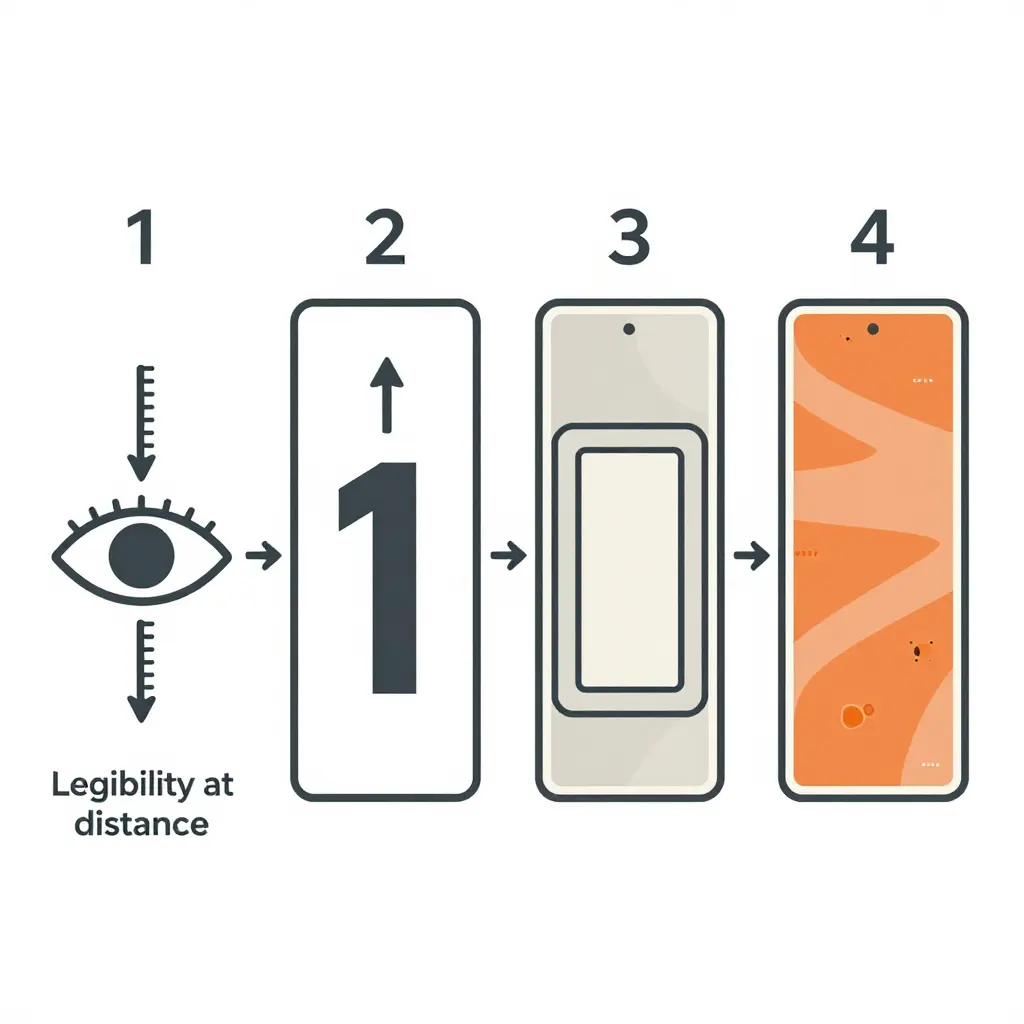
1. Legibility at distance sets a minimum digit height
A marshal at a post or a timing beam has to read the number, not a photographer standing two metres away. When a body publishes a height for that viewing distance, the question is settled. Five inches on a motocross plate and three and a half on an off-road plate are floors, and they do not come down for a design that would look better with smaller numerals.
2. Height plus stroke width sets the number box footprint
A digit is a shape with thickness, not a line. Height plus minimum stroke gives the smallest rectangle a single character can occupy, and two or three characters give the number box. In AMA motocross that rectangle is effectively the whole plate, since nothing else is permitted inside it apart from the front-plate sponsor strip. On other plates it is a hard island that background art has to route around.
3. Footprint minus plate area leaves the real design room
Subtract the number box from the plate, then take off the trim margin the vinyl needs to wrap the plastic without lifting. What remains is space for background graphics, small marks and colour blocks. On a typical plate that comes out as narrow bands and corner pockets rather than one open field.
4. That leftover room is the design envelope
Customers notice this as a feeling about the finished kit without being able to name the cause: the graphics run around the digits instead of through them, and the plate reads as composed rather than crowded. Decals that climb over a numeral can look sharp in a flat mock-up and still fail inspection on race day. Lock the number box first, then place logos and colour into the shape that survives; every graphics kit we produce is drawn in that order.
Why the tallest requirement wins
One plate often has to serve more than one class, and the minimums do not match. Motocross asks for 5-inch numerals; the off-road disciplines ask for 3.5-inch numerals on plates at least 7-1/8 inches high and 10-1/4 inches wide. Clubs and series add variations on top of that, so a plate that passes at a club race is not guaranteed to pass at a national event.
Build to the biggest number on the bike
The tallest minimum among the rider’s classes governs the job. Someone racing motocross on Saturday and an off-road event on Sunday gets 5-inch digits, because drawing the plate twice costs more than drawing it once at the larger size. A youth rider moving up a class is the same problem in slow motion: the number area usually has to be rebuilt, and the rest of the kit rarely survives untouched either.
| Rider’s season | Digit height the plate must carry |
|---|---|
| Motocross only | 5 in (127 mm) |
| Off-road or enduro only | 3.5 in (89 mm) |
| Motocross and off-road in the same season | 5 in (127 mm) |
| Any class whose series sheet is stricter than AMA | The series figure |
That one figure settles the side panel area, the gap between digits, the amount of clear background behind each numeral, and how far the shroud graphics can run before they crowd the plate.
When you brief a designer, hand over the largest minimum you will race under rather than the one that applies on the day of the order. If you want templates that already leave room for tall digits, browse our KTM graphics kits and look at how the number panels are laid out before committing to a custom design.
Quick design checklist
- List every class the rider may enter this season, then circle the tallest minimum.
- Measure the printable height of the number area rather than the whole plate.
- Keep at least one digit width of clear space around the number.
- Lay the digits in solid vinyl or a solid colour block. AMA rules prohibit shading and outlining, so an outlined numeral that reads well at speed can still fail inspection.
- Re-check the rules when a rider moves up a class, since plate shapes change with it.
Before a set of number plate decals goes to print, confirm the constraints below. Figures quoted from a rulebook are cited; the rest are workshop practice and worth labelling as such.
- Minimum digit height: 5 in (127 mm) for AMA motocross, 3.5 in (89 mm) for AMA off-road. Youth, mini and electric classes usually follow their own series sheet and those figures are often smaller, so read the class rules rather than scaling the adult number down.
- Digit width: rarely specified. The practical floor is around two-thirds of the height; below that a numeral stops reading in dust and glare.
- Stroke thickness: also rarely specified, and decided in practice by the material. Plotter cutting needs roughly 3 mm to 5 mm of stroke to weed cleanly, and textured or curved panels need more.
- Spacing between digits: half a digit width works for two- and three-digit numbers. Tighter than that and the characters merge at distance.
- Spacing to the plate edge: keep 10 mm clear on every side and 15 mm along the top edge, where the plastic curves away and trim tolerance bites hardest.
- Nothing else on the plate: AMA motocross permits only the number, plus a 2-inch sponsor or name strip at the top of the front plate. A sponsor logo on a side plate is a rule violation in that series, however small it is.
- Three plates, matching numerals: AMA requires three number plates, and the number on the bike must match the number on the rider.
If you want a head start, browse KTM graphics kits built with number panels already sized to common rule sets, then adapt the art to your customer’s class.
Converting Size Rules into a Layout Grid
With the height, stroke and clear space fixed, those numbers become a grid: zones that the artwork hangs off. Get the geometry right and the rest of the layout stops arguing with itself.

1. Set the outer trim margin first
Draw a buffer line inside the plate edge before anything else. It absorbs cutting tolerance, curved body panels and the small amount of stretch every vinyl application produces. Lettering, numbers and sponsor marks all stay inside it.
2. Place the number box first
Position the number box before any background art, stripe or logo. It is the element that cannot be compromised, so it gets first claim on space, and everything else fills in around it rather than being designed first and squeezed in later.
3. Centre the digits vertically, then check symmetry across the pair
Measure from the top and bottom edges of the plate to the digit block and split the difference, so the number sits optically centred. Curved panels usually need a millimetre or two of lift to look level. Then mirror the grid left to right so the two plates read as a pair.
4. Check each plate individually
Mirroring is the starting point, not the finish. Sponsorship space and panel shapes differ from side to side; an exhaust cut-out, a shroud curve or a single-sided sponsor requirement pulls the usable area off centre, and a grid that is perfect on one side can crowd the number on the other.
5. Reserve zones for background graphics and small marks
| Zone | Role | Rule of thumb |
|---|---|---|
| Outer trim margin | bleed and cut tolerance | keep all artwork inside it |
| Number box | digit footprint | placed first, never resized to fit art |
| Vertical axis | digit centring | measured from both plate edges |
| Reserved graphic zones | background art, stripes | filled last, never over digits |
| Small mark zones | sponsor logos, class tags | equal clearance from digits on both plates |
Block out the reserved zones early, label them, and treat them as off-limits until the number is signed off. When you are sourcing artwork, look for sets built on this logic: plate-ready KTM graphic sets already respect the trim margin and digit footprint, which saves you rebuilding the grid.
A grid built this way keeps custom dirt bike graphics and race numbers from fighting over the same pixels, and turns every later proof or colourway into a short job instead of a rebuild.
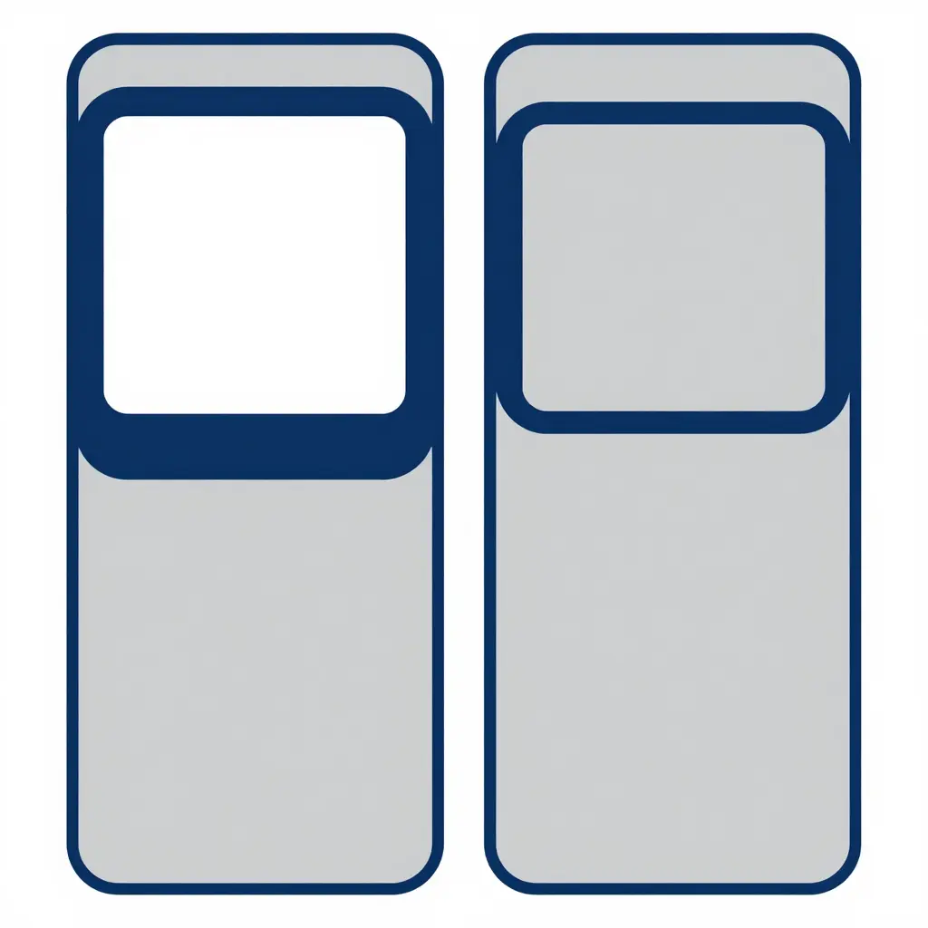
Left: a large required digit size eats the plate, leaving only slim shaded strips for artwork. Right: a smaller number box frees wide shaded blocks for colour, stripes or sponsor-style shapes. Same plate, very different canvas.
Vinyl Materials and Production Constraints: Why the Build Method Decides Compliance
Whether a plate passes inspection is mostly settled before the printer runs. The film, the way the digits are made, the laminate over them and the surface they sit on all impose hard limits on the smallest stroke, the sharpest corner and the usable life of the plate. For anyone commissioning custom dirt bike graphics, those limits define what is achievable inside a rulebook’s height and legibility requirements. Artwork that ignores them is either rejected at inspection or degrades out of compliance after a season.
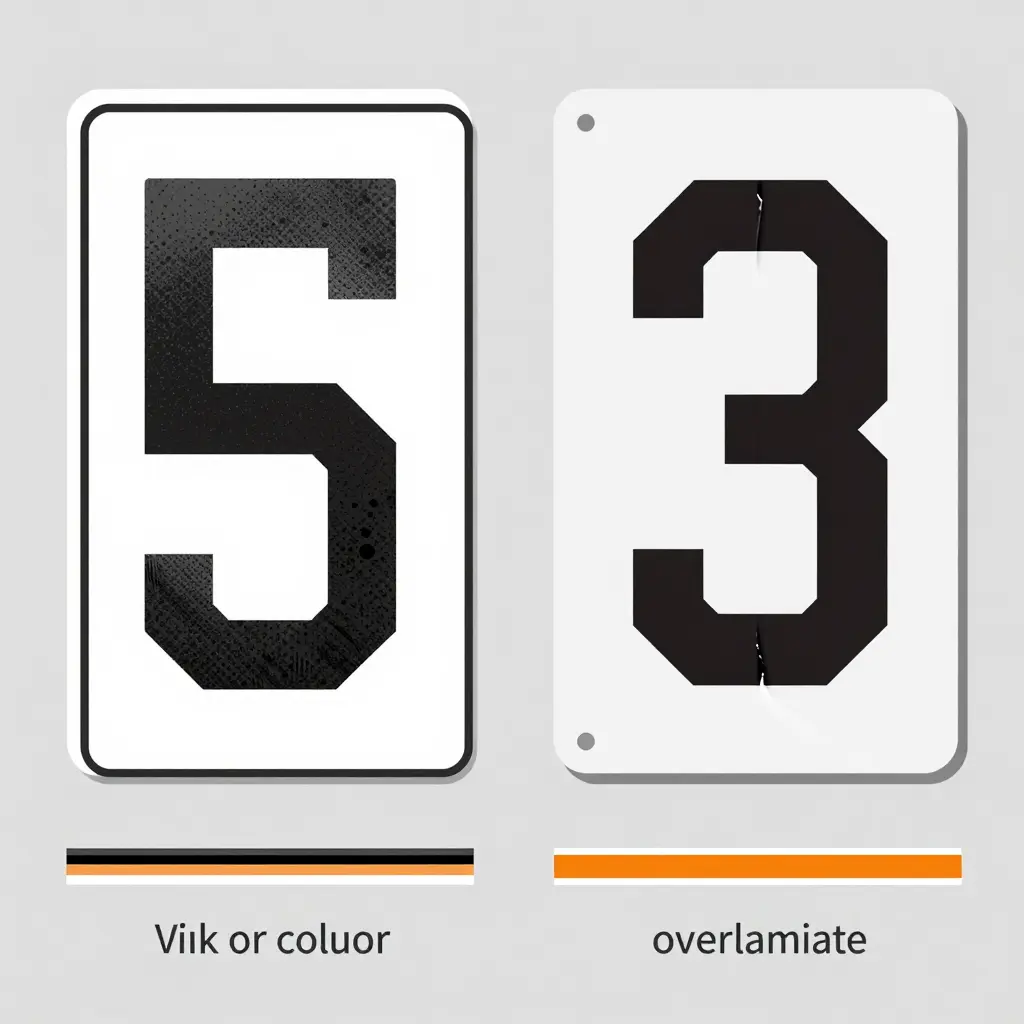
Printed vinyl versus cut-and-applied vinyl
Printed vinyl carries the whole design on one sheet, produced on a wide-format solvent, latex or UV printer and then laminated. Gradients, photographs and multi-colour sponsor stacks come out in a single pass, but every digit edge is ink on substrate, and that edge is only as sharp as the resolution and the media allow.
Cut-and-applied vinyl reverses the logic. Each colour, digits included, is plotter-cut from coloured film and applied as a separate layer onto a base panel. The digit boundary is a blade line rather than a dot grid, so the letterform holds at any size, and cutting also makes fine counters and tight radii practical to weed and transfer.
| Method | Digit edge definition | Strengths | Constraints |
|---|---|---|---|
| Printed vinyl | Ink boundary, softened by wicking and lamination | Unlimited colours, gradients, photos | Resolution-limited edges at large sizes, ink fade risk |
| Cut-and-applied vinyl | Mechanical film edge, a cut line rather than a dot grid | Crisp outlines at any size, solid colour density | Limited colour count, minimum stroke and counter widths |
| Printed plus cut outline | Printed fill with a cut border layer | Sharp silhouette with printed detail | Extra layer thickness, more application time |
Why cut vinyl digits on a solid background panel give the crispest edges
Two things combine. A solid background panel removes competing printed texture behind the number, so the only contrast boundary on the plate is the film edge itself. And because that edge is cut rather than printed, it is not subject to dot quantisation or ink spread: straight stems stay straight, radiused corners stay uniform, and the silhouette still matches the layout drawing at front-plate sizes, where printed edges visibly soften.
The trade-off is a design constraint. Cut vinyl needs a minimum stroke width and a minimum counter width, typically 3 mm to 5 mm depending on film thickness and plotter, and numerals with narrow apertures such as 4, 6, 8 and 9 may need to be redrawn slightly bolder to survive cutting while staying inside the permitted digit height. Template-driven kits built around a specific shell, such as the Surron Light Bee number plate decals, carry those stroke widths and digit positions already worked out for that bodywork instead of leaving them to guesswork.
Laminate choice and fade resistance
Laminate is not cosmetic. A cast gloss, cast matte or thicker anti-graffiti overlaminate shields the colour layer from UV, fuel spill, mud and pressure washing. Cast film with a UV-inhibited adhesive and a quality laminate holds colour far longer than unlaminated calendered stock, which is why fade-resistant vinyl is the only sensible specification for anything that lives on a front plate or side panel.
Fade also affects compliance. A digit that loses contrast against its background eventually fails a legibility check, and a plate that has yellowed or chalked reads as non-conforming even when its dimensions are still correct. Cast, laminated, fade-resistant stock extends service life and keeps the layout readable through a full season of sun and wash cycles.
Thin strokes on textured or curved side panels
Textured plastics and tight compound curves are where number plate decals usually fail. Film cannot wet out into a heavy grain, so air stays trapped under thin strokes and the edges lift. On a curve, a stroke laid across a crown gets stretched, and a 1 mm or 2 mm stroke can distort enough to read as a break in the digit. The practical fixes are to raise the minimum stroke width on those panels, keep critical digit edges away from the sharpest part of the curve, or move that panel to printed vinyl with a conformable cast laminate.
Matching construction to the panel rather than to the artwork alone is what keeps a layout compliant. Model-specific templates such as the Talaria MX3/MX4 number plate layout account for the shell’s curvature and texture up front, so stroke weights and digit spacing are set for the material they will be cut from.
Three rules follow from this: cut-and-applied vinyl over a solid panel where edge crispness matters at large sizes, cast laminated fade-resistant stock wherever UV and washing are part of the week, and stroke width treated as a material constraint on textured or curved panels rather than an aesthetic preference.
Plate Dimensions vs. Digit Size Limits
Two numbers decide the layout before any artwork starts: the plate you actually have, and the digit height the class demands. The AMA off-road rulebook sets a minimum plate of 7-1/8 by 10-1/4 inches (about 181 by 260 mm) with 1-inch corner radii; its motocross section requires three plates of OEM material and style, and a minicycle plate no smaller than the one the model came with. Series and clubs can be stricter again.
The table below lines up what the rulebook asks for against what it costs in layout.
| Discipline / class | Plate minimum | Digit height minimum | Layout consequence |
|---|---|---|---|
| AMA motocross (adult) | Three plates, OEM material and style | 5 in (127 mm) | Number fills the plate; the only sponsor space is the top 2 in of the front plate |
| AMA off-road / enduro | 7-1/8 by 10-1/4 in (181 by 260 mm), 1 in corner radii | 3.5 in (89 mm) | Shorter digits than motocross, so more background area survives |
| Minicycle / youth | No smaller than the plate the model came with | Set by the series | Small plate, small digits; sponsor marks often have to go entirely |
| Electric (Light Bee, Talaria, 79bike, eRide) | Measure the actual shell | Set by the series | Vents, seams and bolts cut usable flat area well below the nominal outline |
Read the last column as your brief. Where the plate is small the rule does not bend, so the sponsor stack has to. Build the number at minimum height plus stroke, then place graphics in whatever real estate survives. For compact machines, browse Talaria MX3 and MX4 graphics to see how tight plates are handled without crowding the digits.
One practical rule: design at the largest minimum the rider expects to race under, not the smallest. A layout that clears the tallest figure will clear the shorter ones; the reverse is how a plate ends up undersized for the class that matters.
Before you upload artwork or approve a quote, lock the number size down in a fixed sequence. Guessing later is where budgets and deadlines go to die.
- Confirm the governing rule set for every class the rider enters. Pull the current rulebook for each class on the entry list, since a rider entered in two classes can be bound by two different minimums. Write both sets down side by side so nothing is decided from memory.
- Record the largest minimum digit height. Compare the required heights and highlight the biggest one. That single figure becomes the target height for the whole design.
- Measure the actual plate area on the bike model. Put a tape measure on the real side panel or front plate and note usable width and height, ignoring compound curves and bolt heads. The plastic often disagrees with the spec sheet, and the tape measure wins.
- Set the number box in the layout. Draw that measured box and keep every digit, edge gap and sponsor mark inside it. Once the box exists, the design stops drifting and the typography has a hard boundary to obey.
- Check contrast and stroke width at final size. Print or preview at 100 percent and look at the digits the way a marshal will. Thin strokes collapse and low contrast disappears in motion, so if a digit fails here, thicken it now rather than paying for a second print run. This matters as much on small electric platforms as on full-size machines, so review the Talaria Komodo graphics to see how production-ready plates handle tight panels.
- Confirm the mirrored opposite-side plate. Build the opposite side as a true mirror of the approved left side, then re-check digit height and box clearance on the reversed artwork. Skipping this step is how one side ships correct and the other ships cramped.
Run the sequence once, in order, and the revision cycle usually ends before a file reaches the printer.
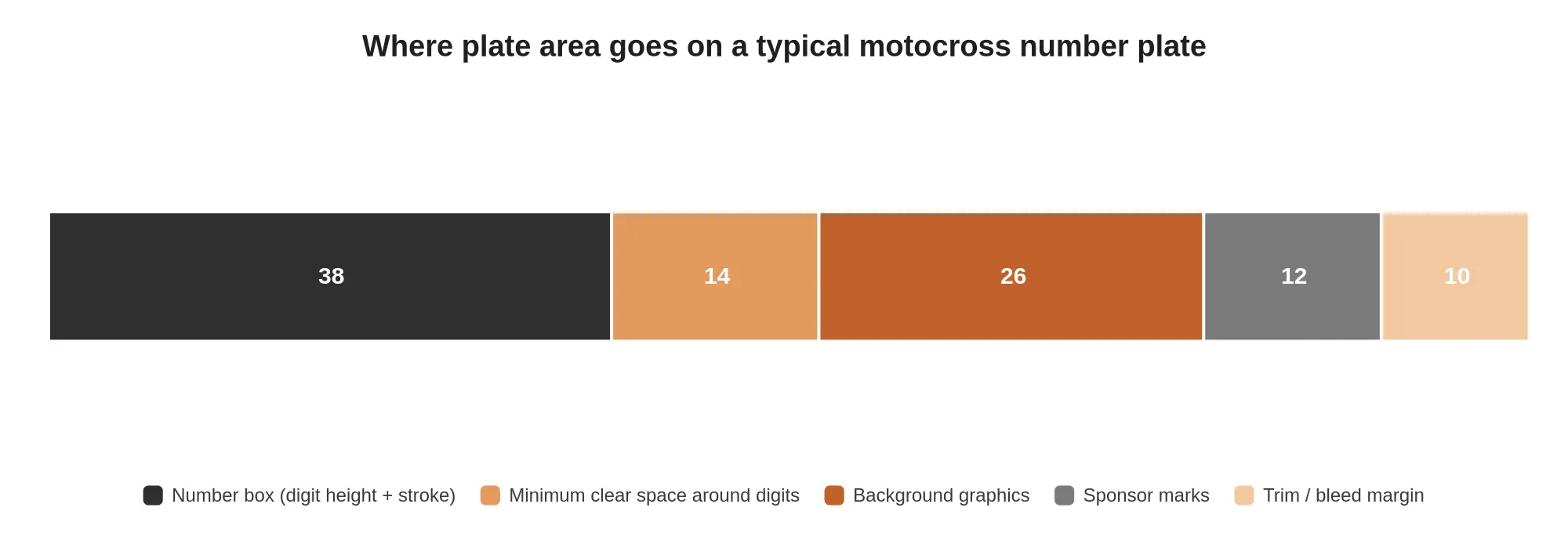
Numbers and graphics share the same small piece of plastic, and the split is rarely even. Once regulations are applied, the surface of a typical number plate divides roughly as the chart below shows.
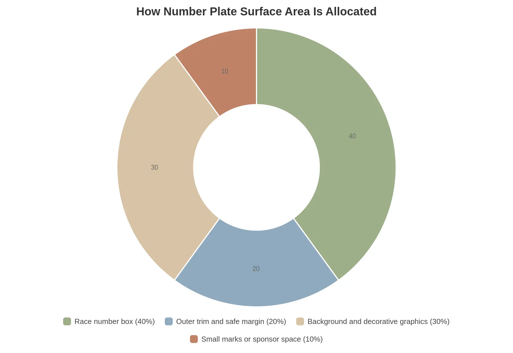
The race number box is fixed by rule and cannot be shrunk or covered, while background art, trim and small marks absorb whatever space remains. That is why custom graphics kits are designed around the digits first and decorated second. Under AMA motocross rules the squeeze is tighter still: sponsor marks belong on the 2-inch strip at the top of the front plate, not scattered across the side plates.
Common Layout Mistakes That Break Compliance
Most of the failed inspections we see on custom dirt bike graphics come down to a short list of repeat offenders. Each one looks harmless in a zoomed-in design file and each one is expensive to correct after print.
-
Digits shrunk to make a design fit. When the artwork is built first and the numbers squeezed into whatever space is left, the digits drop below the minimum height and the set fails the tape measure.
-
Numbers centred on a curved or tapered panel. On a shroud that rolls away or narrows toward the tank, a digit that measures correctly in flat artwork loses visible height once wrapped, so the printed number reads smaller than the rules permit.
-
Low-contrast numbers and backgrounds. White digits on pale grey camo or black on deep navy look sharp on a monitor and collapse into mush at race distance, which gets the plate flagged in scrutineering.
-
Decorative elements overlapping the number box. Splatter, sponsor marks, jagged brand shapes or extra pinstripes that creep into the reserved area steal the clear space the digits need and force a full redesign.
-
Inconsistent number size between left and right plates. A visible mismatch means an official cannot confirm both plates match the declared figure, so a plate that looked balanced fails as a set.
-
Digits pushed too close to the plate edge. When a number sits within a few millimetres of the trim line, wrap stretch and cutting tolerance bite into the digits, and the finished height comes up short.
-
Outlined or shaded numerals. Outlining is a common trick for making digits read at distance, and AMA rules prohibit it outright. A plate built that way fails inspection by design rather than by accident.
All seven are caught the same way: compliance is checked at final printed size, never on a zoomed-in screen mock-up.
Race Number Legibility Distance by Digit Height
Extra millimetres on a digit buy distance, though not at a constant rate. The chart below plots digit height against the distance at which a marshal or rider can still read the number cleanly.
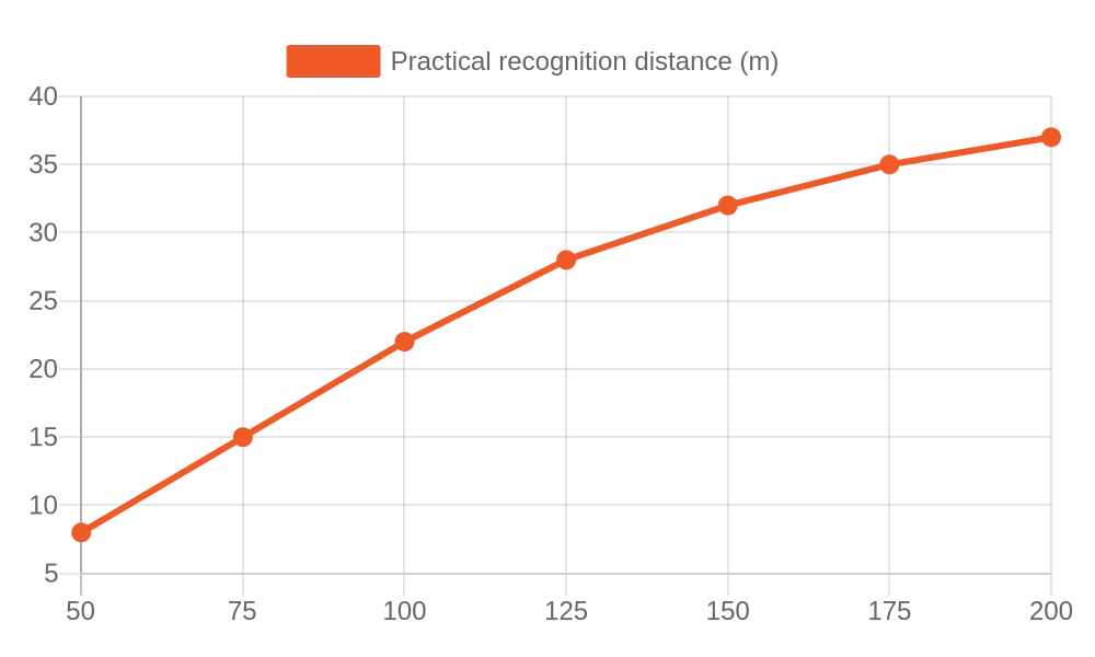
The curve flattens at the top end, which is why pushing digit height past the rule minimum returns less recognition distance than the plate area it consumes.
FAQ: Race Number Size Rules and Number Plate Layout
Do number size rules differ between organizations?
Yes, and by more than most shops expect. Each sanctioning body sets its own minimum digit height, font and legibility requirements, and its own view of what may sit on the plate, and those figures shift between local clubs, national federations and series promoters. AMA asks 5 inches for motocross and 3.5 for off-road, and neither figure will match a local club’s rulebook. Record the customer’s series on the order form and check the current rulebook before artwork is approved, because a plate that passes tech at a club race can fail at a national event.
Can the number be printed as part of the background graphic?
Often yes, and it is usually the cleaner option: printing the digits into the base graphic keeps registration exact, removes edges that lift under a pressure washer, and avoids trapping air under a separate decal. Check what the series allows behind the number first. Under AMA motocross rules nothing but the number may appear on the plate, so a fully printed background can fail even when the numeral itself is correct. Keep a layered master file either way, so the number can be changed later without reprinting the whole kit.
How much clearance is needed between the digits and the plate edge?
As a working minimum, ten millimetres (about 0.4 in) on all sides, and 15 mm along the top edge where the plate curves away. Most rulebooks expect a band of unprinted background around the digits anyway, and under AMA motocross rules nothing but the number may appear on the plate at all. Tight clearance is one of the commonest reasons a plate fails scrutineering, so treat the margin as fixed and reduce digit size instead of shaving the gap. Build the buffer into the layout at the vector stage.
Must both side plates carry identical number sizes?
Not always, and the distinction matters. Most rules require the same digit height, stroke weight and font on both sides, but plate area frequently differs on the exhaust side, so width and placement can vary while height stays constant. Mirror the digits for correct reading on the opposite side, and keep contrast identical so both plates photograph the same. AMA requires three plates, its off-road section specifies uniform size and shape, and the number on the bike must match the number on the rider. Where a series does demand identical sizes, adjust the smaller plate first and let the larger panel absorb the leftover space.
What should I do when a bike model has an unusually small plate area?
Measure the true flat surface rather than the nominal plate outline, because vents, body seams and mounting bolts remove usable space. If the digits cannot reach the required height, the workable options are a narrower font the series approves, a permitted relocation to the rear fender or fork guard, or a full-coverage background panel that creates its own print area. Compact electric frames are the usual case; our Surron Ultra Bee graphics show how much flat panel area that chassis actually offers. Confirm with the promoter before redesigning, since moving a number changes which rules apply.
Closing Summary: Fixed Numbers, Derived Plate, Remaining Space
The order of work runs one way. The race number size rules are fixed inputs, pulled from the class rulebook and never bent to suit the artwork. The number plate layout is derived from those measurements rather than dragged out of a template the digits get squeezed into. Every other element, from shroud panels to fender stripes, fills only the space that is left over.
Before production, check a short and unglamorous list on every order: the exact digit string and font, the size limits against the relevant rulebook, plate placement with bleed and trim allowance, bike model and year, substrate and finish, and a proof reviewed at 100% scale rather than on a zoomed-out screen. Ordering number plate decals for 79bike models or eRide number plate decals sized to class limits only produces a clean kit when those checks are signed off, and they matter just as much for any dirt bike graphics set regardless of brand or model.
Accuracy at final size is the test that settles it: a digit that measures 30 mm on the 100% proof has to measure 30 mm on the printed plate.